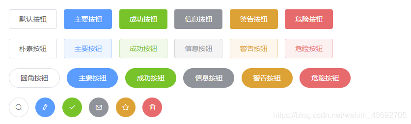
АДХЅзщМў(ЪОР§)
1.ФЌШЯбљЪНАДХЅ
<el-row>
<el-button>ФЌШЯАДХЅ</el-button>
<el-button type="primary">жївЊАДХЅ</el-button>
<el-button type="success">ГЩЙІАДХЅ</el-button>
<el-button type="info">аХЯЂАДХЅ</el-button>
<el-button type="warning">ОЏИцАДХЅ</el-button>
<el-button type="danger">ЮЃЯеАДХЅ</el-button>
</el-row>
2.МђНрАДХЅ plain ЪѓБъвЦЖЏЩЯШЅВХЛсЯдЪОБГОАбеЩЋ
<el-row>
<el-button plain>ЦгЫиАДХЅ</el-button>
<el-button type="primary" plain>жївЊАДХЅ</el-button>
<el-button type="success" plain>ГЩЙІАДХЅ</el-button>
<el-button type="info" plain>аХЯЂАДХЅ</el-button>
<el-button type="warning" plain>ОЏИцАДХЅ</el-button>
<el-button type="danger" plain>ЮЃЯеАДХЅ</el-button>
</el-row>
3.ЪЙгУдВНЧАДХЅ round
<el-row>
<el-button round>дВНЧАДХЅ</el-button>
<el-button type="primary" round>жївЊАДХЅ</el-button>
<el-button type="success" round>ГЩЙІАДХЅ</el-button>
<el-button type="info" round>аХЯЂАДХЅ</el-button>
<el-button type="warning" round>ОЏИцАДХЅ</el-button>
<el-button type="danger" round>ЮЃЯеАДХЅ</el-button>
</el-row>
4.ЭМБъАДХЅ idco:ОпЬхвЊЯдЪОЕФЭМБъ
<el-row>
<el-button icon="el-icon-search" circle></el-button>
<el-button type="primary" icon="el-icon-edit" circle></el-button>
<el-button type="success" icon="el-icon-check" circle></el-button>
<el-button type="info" icon="el-icon-message" circle></el-button>
<el-button type="warning" icon="el-icon-star-off" circle></el-button>
<el-button type="danger" icon="el-icon-delete" circle></el-button>
</el-row>
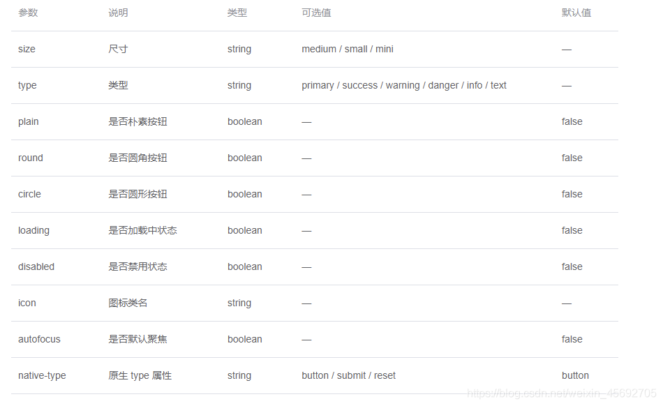
АДХЅзщМўЕФЯъЯИЪЙгУ
ШеКѓЪЙгУelement uiЕФЯрЙизщМўЪБашвЊзЂвтЕФЪЧ ЫљгазщМўЖМЪЧel-зщМўУћГЦПЊЭЗ
ДДНЈАДХЅ:<el-button>ФЌШЯАДХЅ</el-button>
зщМўЪєадЪЙгУ
змНс:дкelementжаЫљгаЕФзщМўЕФЪєадЪЙгУЖМЪЧжБНгНЋЪєадУћ=ЪєаджЕЗНЪНаДдкЖдгІЕФзщМўБъЧЉЩЯ,booleanРраЭЕФЪєадФЌШЯЮЊfalseПЩвдМђаДвЛИіЪєадУћзжБэЪОЮЊtrueЁЃ
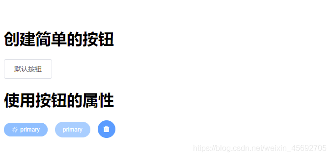
ЪОР§
<div>
<h1>ДДНЈМђЕЅЕФАДХЅ</h1>
<el-button>ФЌШЯАДХЅ</el-button>
<h1>ЪЙгУАДХЅЕФЪєад</h1>
<el-button type="primary" size="mini" round="true" loading>primary</el-button>
<el-button type="primary" size="small" round="true" disabled>primary</el-button>
<el-button type="primary" size="medium" circle icon="el-icon-delete-solid"></el-button>
</div>
АДХЅзщЕФЪЙгУ
АДХЅзщЕФЪЙгУОЭЪЧЭЈЙ§<el-button-group>АбЖрИіАДХЅАќЙќЦ№РД
 	  <el-button-group>
        <el-button type="primary" plain round icon="el-icon-back"></el-button>
        <el-button type="primary" plain round icon="el-icon-right"></el-button>
      </el-button-group>

cs