body {
background-color: black;
}
div {
margin: 200px auto;
width: 1000px;
font-family: 'Segoe UI', Tahoma, Geneva, Verdana, sans-serif;
font-size: 120px;
color: transparent;
}
span {
animation: shan 4s linear infinite;
text-transform: uppercase;
}
div span:nth-child(1){
animation-delay: 0s;
}
div span:nth-child(2){
animation-delay: .4s;
}
div span:nth-child(3){
animation-delay: .8s;
}
div span:nth-child(4){
animation-delay: 1.2s;
}
div span:nth-child(5){
animation-delay: 1.6s;
}
div span:nth-child(6){
animation-delay: 2s;
}
div span:nth-child(7){
animation-delay: 2.4s;
}
div span:nth-child(8){
animation-delay: 2.8s;
}
div span:nth-child(9){
animation-delay: 3.2s;
}
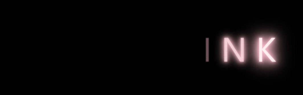
@keyframes shan {
0% ,100%{
color: white;
text-shadow: 0 0 4px pink ,
0 0 10px pink ,
0 0 20px pink ,
0 0 30px pink ,
0 0 40px pink ,
0 0 50px pink ,
0 0 60px pink ,
0 0 70px pink ,
0 0 80px pink ,
0 0 90px pink ,
0 0 100px pink;
}
30%,90% {
color: transparent;
text-shadow: none;
}
}
完整代码
<!DOCTYPE html>
<html lang="en">
<head>
<meta charset="UTF-8">
<meta http-equiv="X-UA-Compatible" content="IE=edge">
<meta name="viewport" content="width=device-width, initial-scale=1.0">
<title>字体闪烁效果</title>
<style>
body {
background-color: black;
}
div {
margin: 200px auto;
width: 1000px;
font-family: 'Segoe UI', Tahoma, Geneva, Verdana, sans-serif;
font-size: 120px;
color: transparent;
}
span {
animation: shan 4s linear infinite;
text-transform: uppercase;
}
div span:nth-child(1){
animation-delay: 0s;
}
div span:nth-child(2){
animation-delay: .4s;
}
div span:nth-child(3){
animation-delay: .8s;
}
div span:nth-child(4){
animation-delay: 1.2s;
}
div span:nth-child(5){
animation-delay: 1.6s;
}
div span:nth-child(6){
animation-delay: 2s;
}
div span:nth-child(7){
animation-delay: 2.4s;
}
div span:nth-child(8){
animation-delay: 2.8s;
}
div span:nth-child(9){
animation-delay: 3.2s;
}
@keyframes shan {
0% ,100%{
color: white;
text-shadow: 0 0 4px pink ,
0 0 10px pink ,
0 0 20px pink ,
0 0 30px pink ,
0 0 40px pink ,
0 0 50px pink ,
0 0 60px pink ,
0 0 70px pink ,
0 0 80px pink ,
0 0 90px pink ,
0 0 100px pink;
}
30%,90% {
color: transparent;
text-shadow: none;
}
}
</style>
</head>
<body>
 <div>
        <span>b</span>
        <span>l</span>
        <span>a</span>
        <span>c</span>
        <span>k</span>
        <span>p</span>
        <span>i</span>
        <span>n</span>
        <span>k</span>
 </div>
</body>
</html>
真正的才智是刚毅的志向。 —— 拿破仑
cs